
Church web design that leads more people to your church.
Get more visitors to your doorstep with effective church web design that focuses on improving your church's online presence.


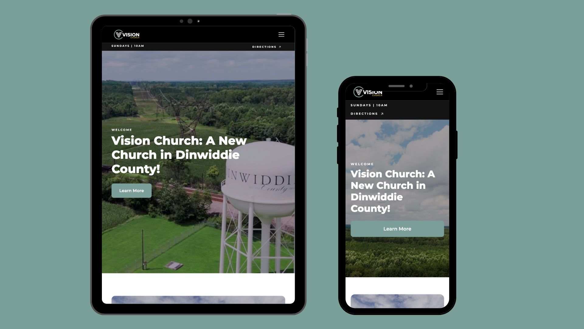
Your church website is the front door to your church.
The average person visits your website before ever stepping foot in your church. If your website doesn't look good, isn't user-friendly, or moves slow, you could be missing out on a lot of potential visitors.
What makes our church web design different?
There are numerous church web design companies in the world, what sets Two Ten Creatives apart?
We design & manage your church website
As web design experts, we understand the rules and guidelines that ensure your website performs well. While church website builders make it easy for anyone to create a site, most people lack the expertise to structure it effectively. A poorly designed website can confuse visitors, hurt search rankings, and fail to communicate your church's mission. That’s why we take the hassle off your hands, delivering a professionally designed website tailored to your church’s needs and managed for optimal performance, so you can focus on ministry.
We optimize your church website for SEO
We care a lot about making websites look good, but we care more about people finding your church. Did you know that the phrase 'church near me' is searched 1.5 million times every single month on Google? To stand out, you need effective SEO for churches that ensures your website is optimized for search engines. By implementing the right strategies, we help your church rank higher and connect with people actively searching for a church in your area.
Our web design services are affordable
In today’s market, custom web design typically starts at $6,000—and that’s just for the initial design. Ongoing hosting and maintenance can cost an additional $300+ per month. Hiring a full-time web designer? That could mean an annual salary of $60,000 or more. With our services, you get the same level of expertise at a fraction of the cost. Our most popular plan is just $250 per month, equating to $3,000 per year—making professional web design both accessible and affordable for your church.
Our website designs are premium quality
We’re passionate about design and believe your church’s online presence should be as beautiful and inviting as your physical building. Unfortunately, many church websites don’t reflect this. That’s why we exclusively use Webflow, a powerful, high-quality web design platform that offers the creative freedom to build truly unique and custom websites. With Webflow, we can bring your vision to life and ensure your website is not only visually stunning but also functional and easy to navigate.
We're fast & reliable
We prioritize swift turnaround times to ensure your designs are ready when you need them. The initial website build typically takes 3-4 weeks to complete, depending on the complexity and requirements. After that, any subsequent requests or updates are typically fulfilled within 1-3 days of your submission, allowing you to keep your website fresh and up-to-date without long waits.
We design a new website for you every 2 years
We offer a complimentary website refresh every two years to ensure your site stays current. With the rapid pace of technological advancements and changing design trends, websites can quickly begin to look outdated. We take care of updating your site, ensuring it remains visually appealing, functional, and aligned with the latest standards. This way, your online presence stays fresh and modern, helping you make the best impression on visitors and potential new members.
Running a church is hard enough. Let us handle your website.
We design websites for churches so you can focus on what matters most—your ministry.
Submit Request
Whether you are requesting a new site or small updates, everything is done with a simple request form.
Design & Develop
We build everything using Webflow, so you'll have a fast, responsive, and stellar website in a short amount of time.
Launch
Once everything is to your satisfaction, we'll have your website live and fully functioning.
Website Features
- Web Design
We create beautiful, user-friendly designs tailored to your church.
- Search Engine Optimization
We optimize your site to boost visibility on Google.
- Website Management
We handle all updates, hosting, and technical maintenance for you.
- Sermon Library
We upload and organize your sermons for easy access by your members.
- Small Group Management
We streamline group sign-ups and communication for your church.
- Event Management
We keep your events calendar updated and accessible for everyone.
- Links Page
We organize all your important resources into one convenient location.
- Unlimited Changes
We make as many updates as you need, whenever you need them.
- Biyearly Website Refresh
We refresh your site every 2 years to keep it modern and engaging.
Custom Church Websites
Check out a few of our custom church website designs.


Pricing
Choose the plan that fits your church's needs. Our sites are offered at a simple monthly or lump sum rate.
Looking for a more affordable option?
We offer premium DIY church website templates.
Additional Services
We offer additional services that can help get more visitors to your church.
Blog


FAQs
Here are some common questions that we get from prospective clients.
Most church website builders are products designed for you to do it yourself, much like TurboTax. We’re a service, doing the work for you, just like an accountant. While we may cost more upfront, we focus on getting you real results. As professional web designers, we know what it takes for your church to get found online. It may seem like more at first (like ongoing accounting services), but it pays off in the long run (like tax season). We believe our ongoing web design services will deliver far more value to your church than a DIY website builder ever could.
Yes, we offer a lump sum payment.
Our plans are month to month. You can cancel or pause your plan at any time. We definitely would love to see you stay with us for the long haul though!
We would hate to see you leave, but if you choose to cancel or pause your plan, we will unpublish your website. Don't worry though, we keep all of our sites on file if you ever choose to start your plan again. For Lump Sum Plans, the site is yours after website completion.
Unlimited changes include adding/removing/editing the following: new pages, landing pages, sermons, events, small groups, photos, website copy, etc. It does not include redesigning website.
Webflow is our preferred method for designing church websites. We also use Framer for most of our DIY Templates. These 2 platforms are what we expertise in.
It depends. If your current site meets our quality standards, we can definitely recreate it on Webflow. If it doesn't, we will be more than happy to build a better site. We do this because we want to make sure all of our sites reflect what our brand is all about—building good church websites.
Yes, we offer SEO Services. This includes: On-Page SEO, Google Business Profile Management, Review Mangement, & Directory Listings.